Last weekend I finally printed a small print run of the Love Poem. As I write this I’m still navigating how I’m going to list and sell them in an online store front. Historically my attempts to sell art online have not gone well. At any rate, I thought I’d talk about some of the design decisions and considerations I made throughout.
Minimalist Design
It was recommended to me some months back that I strip my UX Portfolio down to a minimalist style. So I did. And a lot of people like it. And it got me thinking, “What past designs have I also been overthinking?”
I’ve lost track of the number of visual designs I’ve attempted for this poem. The only other time I screen printed any copies was to test a version that was typed on an old typewriter with a silver ink background. That was a mostly simple design, but not simple and clean.
Helvetica Is Your Friend
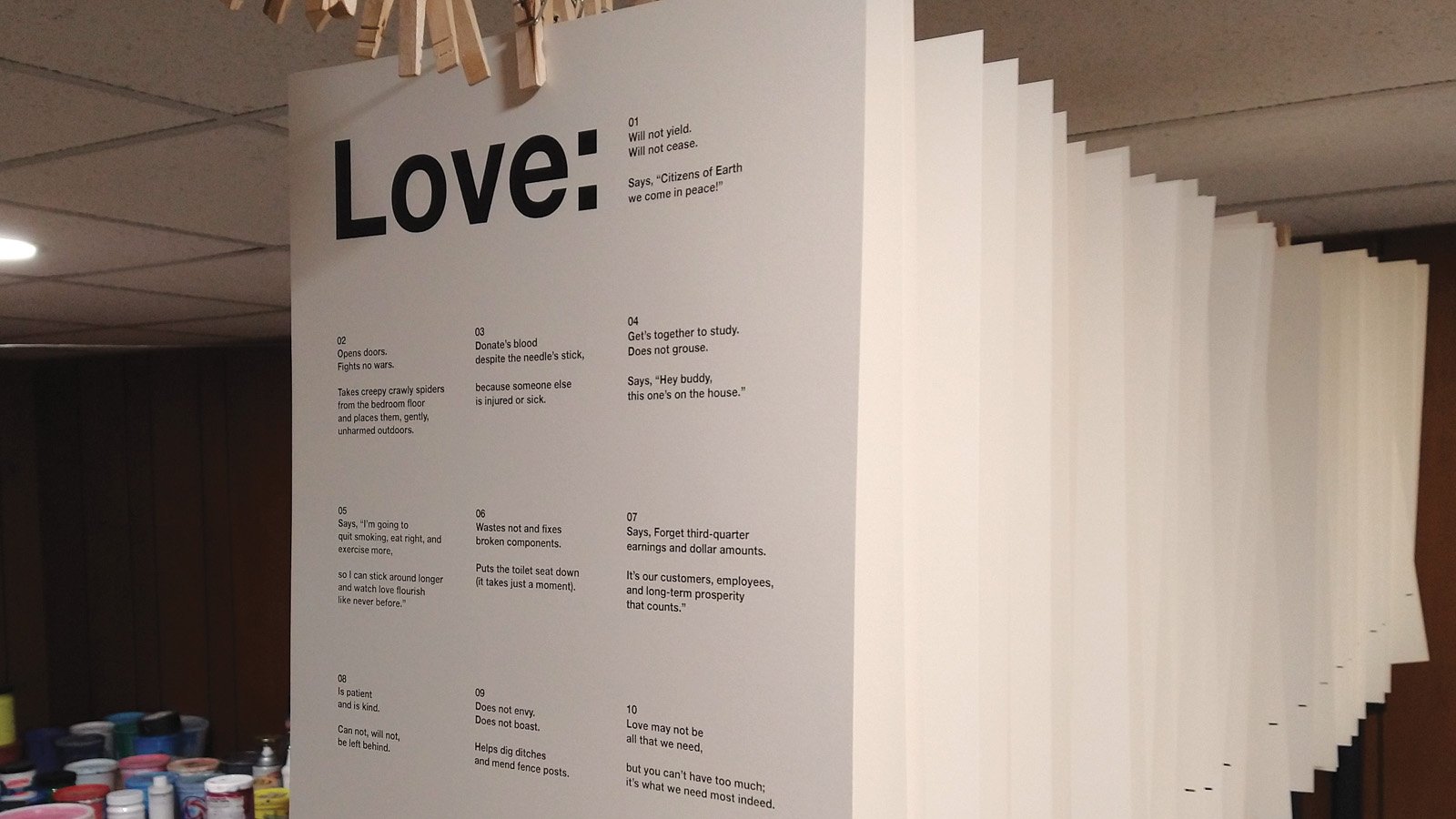
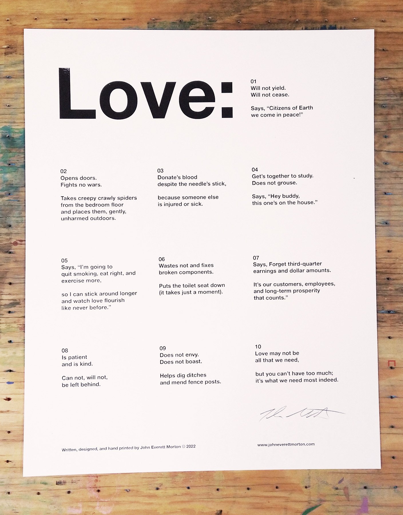
There’s plenty of things I don’t know about type, but I know Helvetica is a classic for a reason. For this design I’m using Helvetica Neue in bold. And that’s it. At this size you still have to be relatively close to read it. I was not bold enough to mess with kerning or tracking or even line height settings.
Get your copy of
The Love Poem
Written, designed, and hand printed by the artist in DeKalb, Illinois.
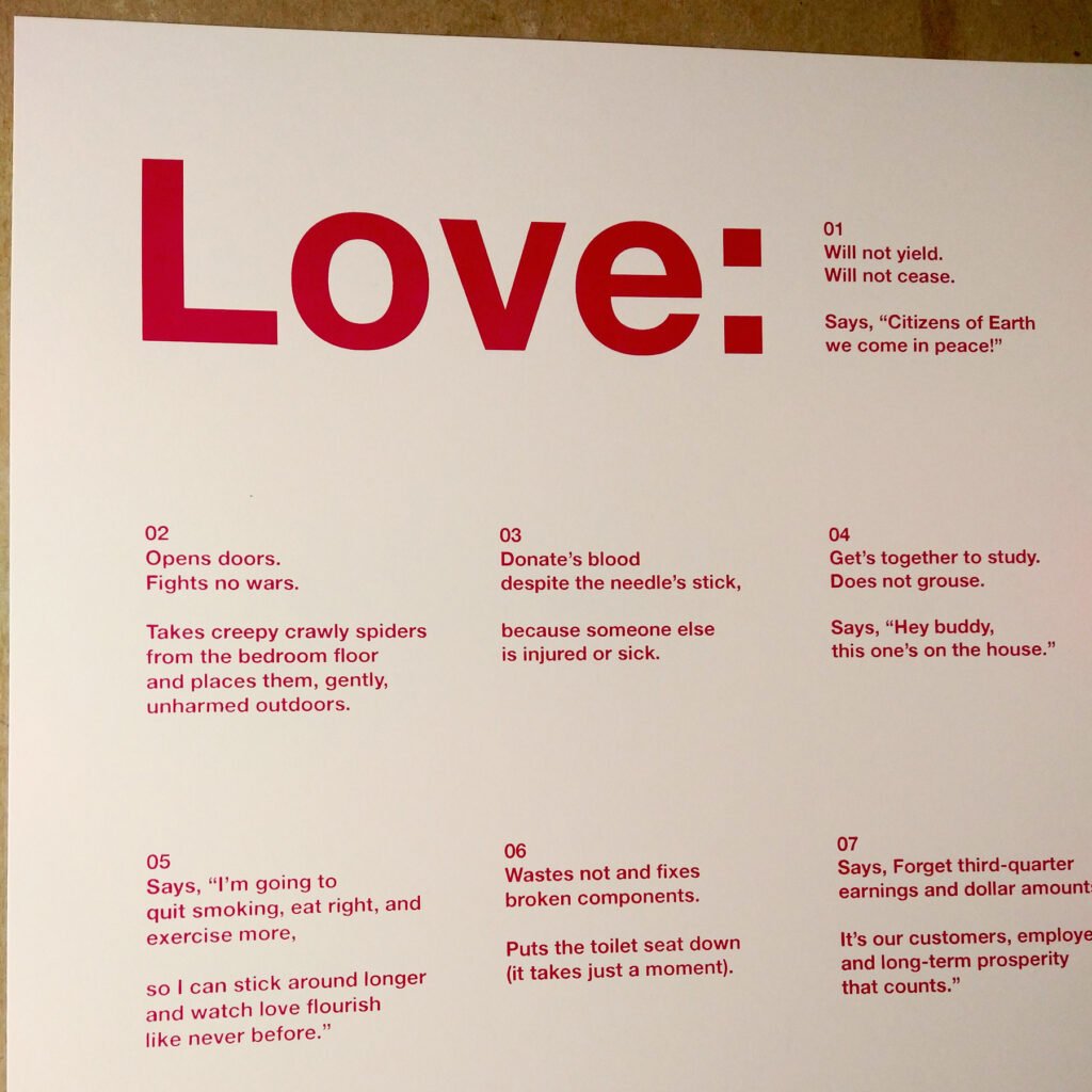
Available in red and black.
Numbered Verses
For inspiration I looked at some Bauhaus posters and other minimal type-based prints. One thing I found a few times was the use of numbers to delineate a section. Although I wouldn’t speak these numbers if I were reciting this poem, the visual cue is an unobtrusive indicator that one is reading this in the correct order.
Some other things I tried: Putting the numbers in parentheses, brackets, and braces (aka curly brackets). With and without a leading zero. With and without a period. I’m not sure I tried it by spelling out the numbers.
The use of lines to establish columns and rows was another experiment. I had to keep reminding myself to keep it simple.
A Tight Fit?
One of the things that drew me to screen printing is the ability to create works of art that are available at a cost the average person can afford. I try to take into consideration how a person would display or frame a thing. Usually that means aiming toward a standard size.
The Love Poem print will fit beneath an 11 x 14 standard mat with margins a little more than half an inch. Designing for 11 x 14 was challenging. I wasn’t sure how capable I would be of burning a screen if the type was too small. (“Burning a screen” is the term for making a stencil with photo sensitive emulsion). With my equipment, a talented printer could probably manage an 8pt font, but I am not as experienced as some others.

Since the parent sheet is 12 x 18, I decided I could add an extra half inch all around. A person could opt for some custom framing with even larger margins. After lobbing three inches off the bottom, the finished cut size is 12 x 15 inches.
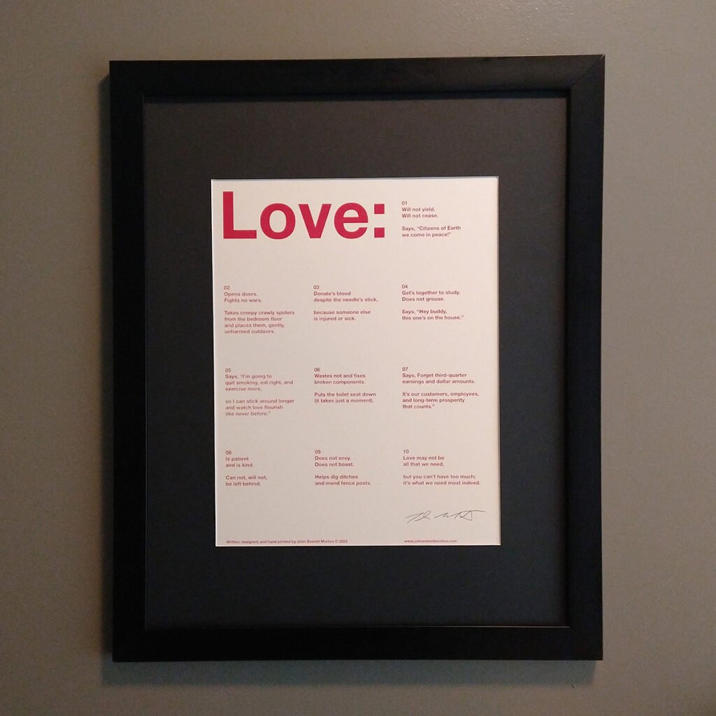
Just Two Colors
I can think of some other versions I might like to see in the future. An early test version had the words in dark blue and the numbers and title in silver. I had some alignment issues when printing two colors. After looking at the ones that did come out correctly, two colors on one print looked like too much.
The red version leans a little towards magenta. It’s a mix I made from magenta, bright red, a splash of yellow, and just a drop of black.
Now What?
I guess I have to try and sell some of these Love Poem prints. More paper is on the way.I used the last of my 12 x 18 card stock to print these. There are about 40 copies in red and 30 in black. I haven’t yet inspected, cut, or signed them so those numbers may come down.
I’m working on launching a Big Cartel storefront. Maybe tomorrow. Maybe three days from now. It will also include some of my past prints that have been getting ignored in my flat files. I will try to remember update this post with appropriate links when it happens. I’m sure there will be some link at the top that says “Shop” or something like that.
It might be bad for business, but I am planning a free downloadable version as well.

Download “The Love Poem”
Handmade prints not in the budget? We’ve been there. Download the free printable PDF.
Pay what you want. Share with your friends.
Available in both US Letter and A4 sizes.
Leave a Reply